Length
3 min read
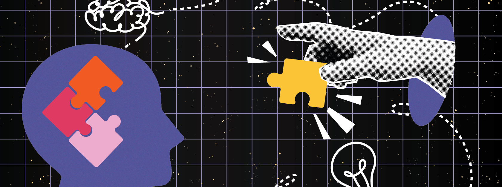
In the world of digital design, accessibility often gets boiled down to ticking boxes and meeting compliance standards. But as anyone who’s worked closely with neurodivergent individuals knows, real inclusion can’t be measured by checklists alone. ADHD, autism, dyslexia, sensory processing differences – each bring unique needs and perspectives that deserve more thoughtful consideration. Designing for neurodiversity isn’t just about checking off requirements. It’s about recognising humanity in all its variations.
What is neurodiversity?
Neurodiversity is the recognition that differences in how people think, learn, and process information are natural and valuable. This includes a wide range of conditions like autism, ADHD, dyslexia, and more. These aren’t deficits to be fixed but variations to be understood. Every neurodivergent person experiences the world differently. That means a design that supports one person’s needs might miss the mark for someone else. That’s why flexibility and choice are essential in inclusive design.
Why accessibility checklists aren’t enough.
Standard guidelines like WCAG are critical for building accessible products. They ensure that core functions work for users with various impairments. But when it comes to neurodivergent users, they often fall short.
For example:
- A cluttered layout might meet contrast and keyboard standards but still overwhelm users with ADHD.
- Auto-playing animations or pop-ups can be distressing for people with sensory sensitivities.
- Figurative or abstract language might be confusing for those who process information more literally.
In short, a website can be technically accessible while still being emotionally or cognitively difficult to use.
What inclusive design for neurodiversity look like.
Inclusive design is ultimately human design. It’s about thinking beyond functionality and asking, “How does this feel to use?”
Here are a few practical ways to design more inclusively:
- Keep it literal: Use straightforward language. Skip the jargon and clever metaphors.
- Reduce noise: Simplify layouts. Use spacing and visual grouping to guide the eye.
- Control sensory input: Avoid flashing or autoplay media. Let users choose when and how to engage.
- Support different ways of engaging: Offer alternatives—text summaries for videos, visual aids for text, etc.
- Give users control: Let them set preferences, skip steps, or take their time.
These aren’t just “nice-to-haves.” They make digital spaces more welcoming for everyone.
More than just inclusion.
When you design with neurodiversity in mind, you make better products – full stop. Clarity helps everyone. Options reduce frustration. And thoughtful design builds trust.
There’s also a practical side. As conversations about neurodiversity grow, people expect more from the digital products they use. Meeting those expectations shows that a brand understands, listens, and cares.
Final thoughts.
Designing for neurodiversity isn’t about throwing out the rulebook. It’s about expanding it. Start with empathy. Ask better questions. Test with a broader range of people.
Because the best digital experiences don’t just meet standards – they meet people where they are.
Want to start designing with neurodiversity in mind? Here are some helpful tools and resources:
- Hemingway Editor – Simplify content and reduce cognitive load
- Microsoft Inclusive Design Toolkit – Human-centered design guidance for real-world inclusion
- Stark – Accessibility plugin with a focus on inclusive interaction design
- neurodivergent.design – UX guidance from neurodivergent voices
- Accessible Brand Colors – Choose visual palettes that reduce sensory overwhelm
Because designing for everyone doesn’t just mean following rules—it means using the right tools, asking better questions, and continually learning from real people.