Length
4 min read
Many people think accessibility in web design is not necessary; they find it limiting or impractical. They consider it a tiny target population, so why bother? However, is that really the case?
For example, have you been in a situation where you have to use a mobile app under a lot of sunlight and find it hard to navigate because of insufficient contrast? Don’t you find websites that automatically display video/audio without your consent annoying, and worse, you cannot control it? And while on video, are you one of those people who watch videos with subtitles rather than audio? Contrary to what most believe, disability is not only permanent, but many of us have also been in a situation where we have experienced a temporary disability, and we benefit from inclusive design. We even benefit from it while not experiencing a disability at all.
Accessibility matters because it benefits everyone. By making your designs accessible, your user base becomes more comprehensive, and you are also increasing user satisfaction and customer engagement. It will also help you to avoid potential legal issues, especially if your website or digital product falls within the government sector. Under the Disability Discrimination Act 1992, Australian Government agencies must ensure information and services are provided in a non-discriminatory, accessible manner.
Here are some designing for accessibility examples to consider when designing visual interfaces; these showcase the importance of accessibility in web design:
Font matters: Make sure your font is readable when working on your design. Sans serif fonts are easier to read on devices due to their clean form compared to serif fonts. Also, other important rules to consider for improving readability include:
- Do not justify text; left-to-right text is easier to read
- The minimum font size to be used should be at least 16px for optimum readability
- Line spacing should be at least 1.5x your selected font size
- Paragraph spacing should be at least 1.5x the line spacing
- Recommended paragraph width should be a maximum of 80 characters per line
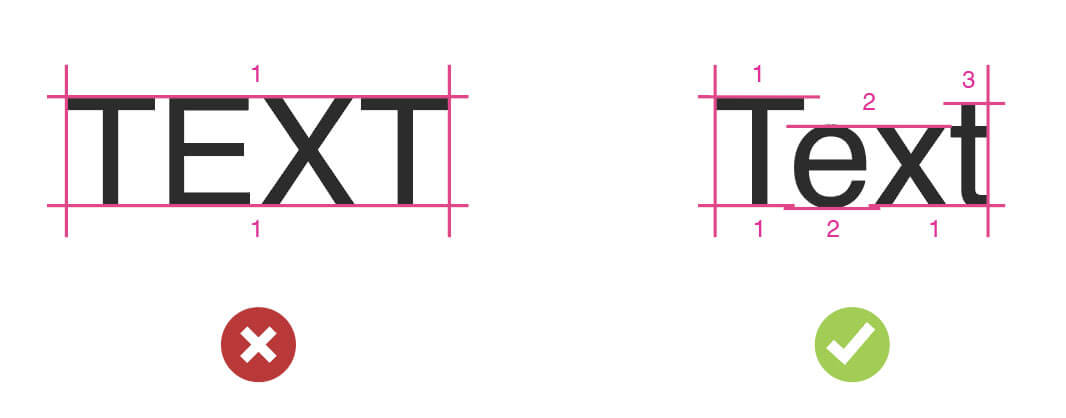
Avoid uppercase text: Uppercase text is problematic to read because words have a uniform rectangular shape, making it challenging to identify words by shape. Also, people with dyslexia find uppercase text hard to read as well. Some screen readers will spell every letter independently rather than reading the whole text.

Words are easier to read when using lowercase text
Colours should have enough contrast: When choosing colours for your text, make sure they have a contrast of at least 4.5:1 for standard text and 3:1 for large text if creating a user interface that complies with WCAG level AA. The contrast must be higher if designing for WCAG level AAA (7:1 for standard text and 4.5:1 for large text), which is a crucial aspect of accessibility in web design
Include transcripts for multimedia content: Make sure any video or audio content has subtitles or a text transcript that people can easily access. This is one of the many designing for accessibility examples that illustrate how accessible design can accommodate various user needs.
Interactive elements should be easy to identify: Do not rely on colour alone to make interactive elements easy to identify. You need to consider your design users who are colourblind. For example, it is recommended that links should be underlined on the body copy so they are easy to identify in the text.

By underlining links, you ensure hyperlinks can be distinguished from standard text for colourblind people.
Forms should be inclusive: Include clear labels that are separate from the form field and ensure users can complete a form without relying solely on a mouse.
Feedback should be easy to identify: Related to the tip above, again, do not rely on colour alone to communicate feedback; use additional cues like icons to notify feedback like error or success messages.

Use visual cues like icons to communicate alert messages on your interface.
Include a sitemap: Provide multiple navigation options to your website by including a sitemap of your site.
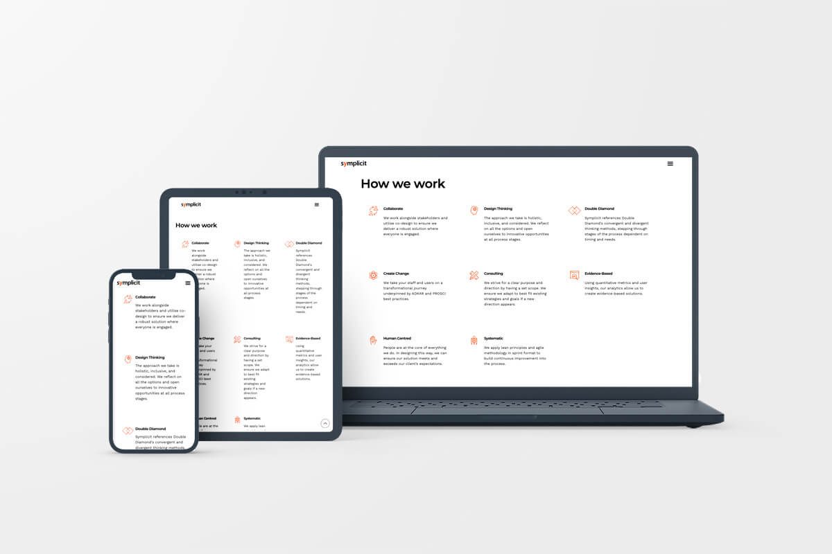
Design should adapt to different screen sizes: Make sure your design is responsive and adapts appropriately to multiple screen sizes.

Make sure your interface can adapt appropriately to multiple screen sizes.
Interactive content should have controls: Make sure any interactive elements like video, audio or image carousels have controls so users can navigate them as they want. Do not play content automatically. Nothing frustrates a user more than losing control of the interface.
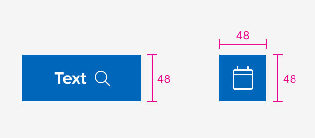
Tap targets should be a minimum of 44px: This is especially important if designing for mobile or touchscreen applications. Make sure the tap target of your interactive elements is a minimum of 44px; Google even goes further by recommending a 48px touch target.

Google Material Guidelines recommend a tap target of at least 48px for optimum usability.
Also, when developing your app or website, do not forget to:
Ensure images have alt text: Provide a clear description of what your image or graphic element represents. This is useful not only for accessibility but also for improving your website’s SEO.
Implement keyboard accessibility: Make sure your website can be accessed by keyboard with an input focus that follows the order of the visual layout.
By implementing these tips, you can ensure your UI is accessible and valuable for everyone.
