Length
3 min read
“Buttons have become the connection point between our will and the user-friendly world” 1
“Measure twice, cut once” embodies the essence of every craftsman’s approach. Regardless of the project at hand, meticulous planning and consideration of design decisions and related outcomes is essential to pre-empt any irreparable inconveniences later.
But do we extend the same diligence when crafting a digital interface?
Let’s consider a simple example: what should the button dimensions be for a user-friendly interaction on a touchscreen? In many instances the resounding reply would be ”44 pixels square!!!”. 44 is the “magic number” everyone remembers.
Apple Human Interface Guidelines2 recommends “44” and the W3S web accessibility/WGAG2.1 standard3 also suggest a similar requirement. However, this answer is not entirely correct. Let me demonstrate why.
Before delving into the technical discussion, let’s look back at some history. Sizing physical controls, such as buttons, leverages, valves, etc., to allow an easy interaction is not a recent problem. This issue dates to the mechanisation that occurred during the First Industrial Revolution, gaining momentum during the Second Industrial Revolution with the advent of complex machinery such as cars, airplanes, and submarines. Standards based on metric systems (e.g. imperial or international) have provided the minimum requirements to design and produce such interactive controls to date.
With digitalisation, touchscreens have become ubiquitous across various sectors, and the need to define design standards remains crucial to guarantee a user-friendly interaction. Several organisations – from the US Department of Defence to the ISO standard organisation – have issued and constantly updated guidelines and best practices based on.

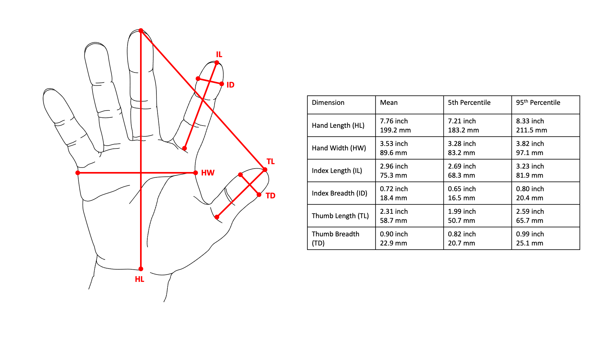
Figure 1 – Example of arthrometric dataset for hand, based on Anthropometry of the hands of male air force flight personnel, 19704
However, here’s the catch. To complicate a seemingly simple task, most initial standards specify these dimensional requirements for buttons in metric units (e.g. millimetres, inches, etc.) while graphical interfaces are frequently designed – or better used to design – using pixels. The presence of two different metric systems can cause confusion, or even errors. While metric systems are based on natural physical units to ensure immutability, the definition of pixels is vague, as quoted by the Cambridge Dictionary – “the smallest unit of an image on a television or computer screen”. Moreover, the physical proprieties of pixels are subject to change, due to the evolution of the technologies that underpin digital displays.
Returning to the “magic number”, 44 pixels. Why is this not the fully accurate requirement to guarantee that everyone can easily interact with a button on a touchscreen?
The reason lies in the mutable nature of pixels in their physical dimensions, which depends on the number of pixels that composes the digital panel at first approximation. In contrast, the original anthropometric datasets provide a detailed knowledge regarding the dimensions of human fingers in terms of average and distribution.
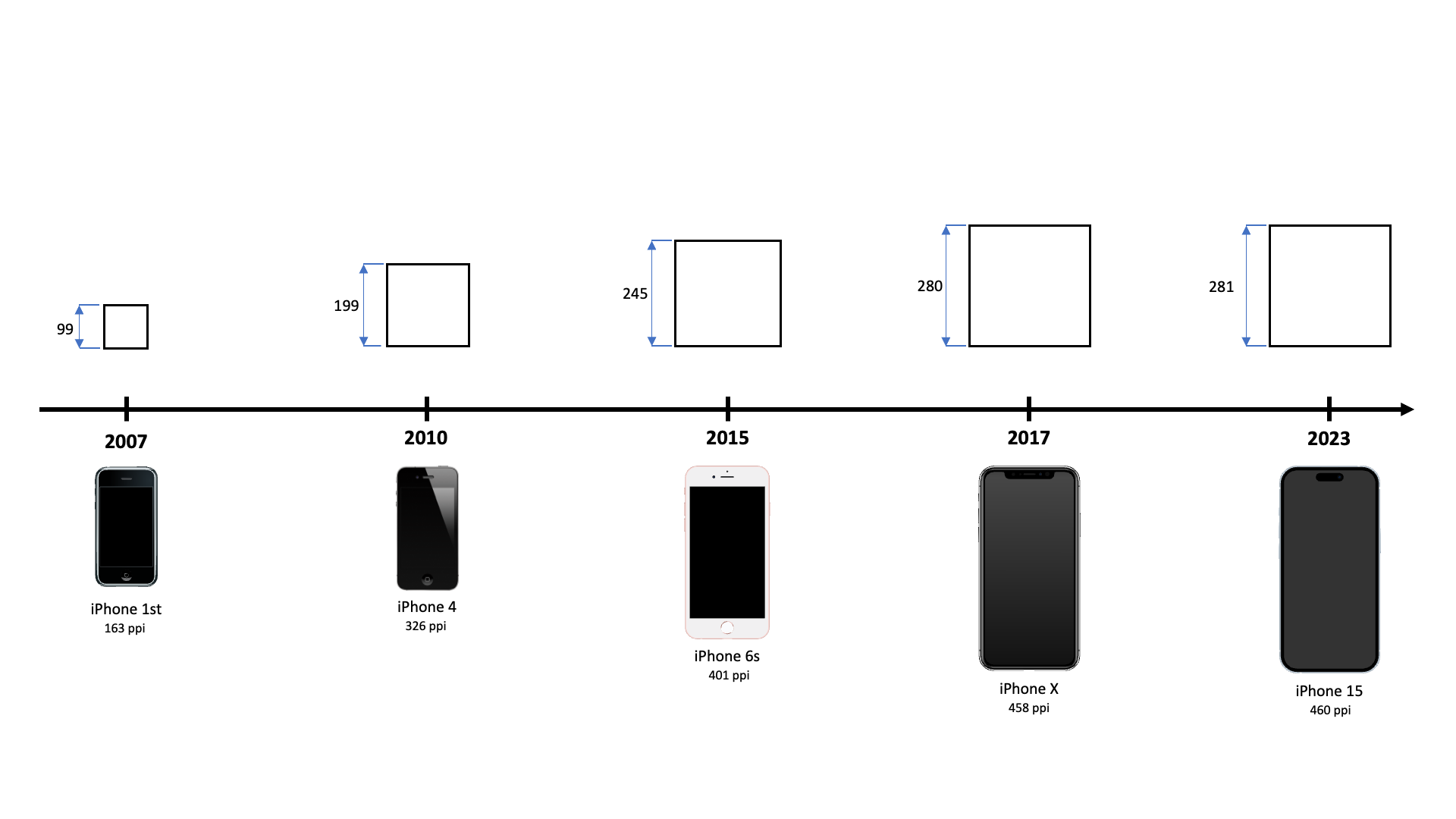
For buttons, Apple’s Human Interface Guidelines recommends dimensions from 22 points (mini button) to a maximum of 64 points (extra-large button) with a regular size of 44 points, approximately 15.53 mm2. The Apple standards are expressed in ‘points’ (that can be converted as a physical dimension) and not in pixel. A quick glance at the table below can show how this requirement has evolved across all the generations of iPhone (2007-2023).

Figure 2 – Screen pixels per inch (PPI) and recommended dimensions in pixels for regular button for iPhone – 2007-2023 (based on date provided by dimension.com, public research project founded by architect Bryan Maddock and maintained by architecture practice Fantastic Offense5)
The WCAG 2.1 success criteria for accessibility standards report its requirements in CSS pixels, which are defined with a physical dimension of 1/96 of inch (or 0.265 mm for those of you who prefer the international metric system)3.
Consequently, here the recommended dimensions of a button should be 44 CSS pixels square, equivalent to an edge of 11/24 of inch or roughly 11 mm.
With just these two examples, we can see how to improve the accuracy of the original question. In our simple case, a button should have a minimum physical dimension, for example, between 11.00 mm to 15.53 mm, based on the adopted accessibility standard (W3S) or design guideline (Apple), which can then be converted in pixels.
If we aspire to create user interfaces that truly embody the concept of “user-friendly”, we require two fundamental elements. Firstly, we must recognise that a “user-friendly” design encompasses a myriad of design decisions spanning the digital and the real world. Secondly, pinpointing the right solution necessitates identifying the right problem at hand. Often, the simple solution (such as “44 pixels square”) must undergo more than just the initial level of analysis before determining the right decision for a user-friendly interaction.
References
3 Understanding SC 2.5.5: Target Size (Level AAA) by W3C Web Accessibility Initiative
4 Anthropometry of the hands of male air force flight personnel by John Garret.
