Private Health Insurance portal re-design
Client
Australian Unity
Services
User research, UX design, Product Design
Industry
Health Care & Life Sciences, Financial Services
Year
2020 – 2022

Impact
Symplicit led the research and design streams for this significant digital transformation to improve Australian Unity members’ customer satisfaction (as measured by NPS).
During the Discovery Phase, the research conducted by Symplicit helped inform the prioritisation of features based on user value and played a critical role in informing the business case, which was successfully funded.
Symplicit was then selected as the design partner for the Delivery Phase through a competitive process. Our design team delivered usability enhancements, simplified content, and improved readability, and achieved a measurable difference in content findability through our Information Architecture (IA) re-design.
Value
Improving user experience was a key tenant of this undertaking. First, we defined user experience as how easy the system was to learn and use. We then created a measurement framework that tracked how successful designs were at achieving these outcomes (learnability and usability). Each re-designed feature was evaluated through moderated user testing and quantitative benchmarking, in which our designs performed in the top percentile for both categories.
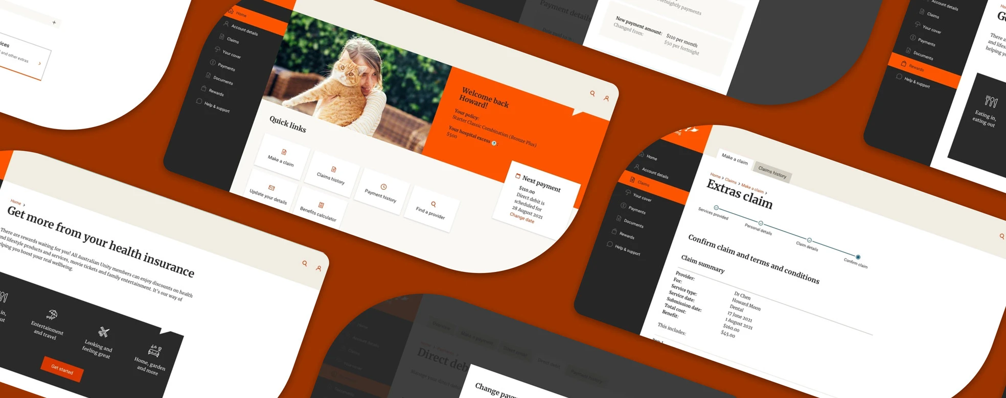
We also gained measurable improvements in task completion time and readability. Through our initial research, Symplicit identified the top tasks users performed on the portal. This insight helped inform a new dashboard design, providing users with quick access to the most essential features. Symplicit also planned longer iterations for these key features, which allowed us to simplify and streamline the designs and deliver time savings for users completing key tasks.
Lastly, our UX writer established tests for copy which entailed readability scores and comprehension tests. All re-written copy achieved an average reading grade of Year 7, and previously complex language was now effortlessly understood by participants in comprehension tests.
Process
Symplicit established a repeatable design process for this engagement with five stages: Inception, Discovery, Design, Test and Deliver. During the Inception Stage, we gathered inputs from business analysts and solution architects to define the functional goals of the feature and the supporting technology and data available.
Next, in the Discovery Stage, we evaluated the existing features, conducted a landscape review to compare the features of competing providers, and analysed existing research and data & analytics.
The insight gleaned from Discovery informed the first lo-fidelity design iteration. These designs fed into design review huddles, in which the technical and business teams reviewed and provided feedback. Next, our team created hi-fidelity designs and clickable prototypes used in moderated user testing sessions.
The Symplicit team utilised qualitative insight and quantitative benchmarks during the Test Phase to validate the efficacy of the design and identify any areas for improvement.
Lastly, the final designs were produced in the Deliver Stage, which included any iterations identified during the Test Stage. Detailed designs were created for mobile and desktop devices, with all states accounted for and mark-ups added for the development team. The final stage was the QA of the developed feature, where designers checked that what was built matched the design and adhered to consistency and standards.
Mindset
Private health insurance can be a complicated subject matter. Our team, with a user-centred approach, focused on simplifying interactions and content across all touchpoints to ease the cognitive load on users.
Designs went through multiple iterations, balancing user needs, technology constraints and business goals.


